The Pretty Interface Trap: When Looks Kill Usability
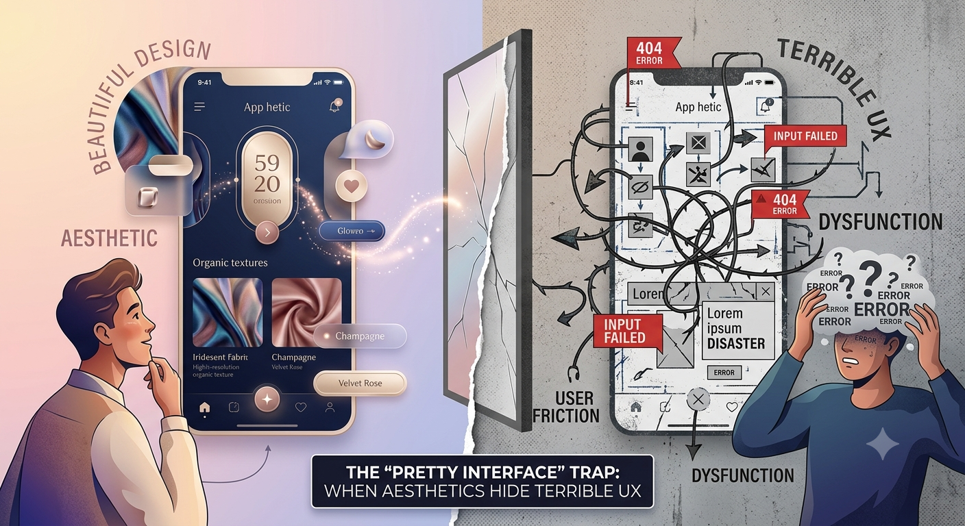
The Glossy Lie
I saw a demo last week for a new project management tool. The UI was, frankly, gorgeous. Smooth gradients, subtle animations on every button click, a custom font that looked like it cost a fortune. It felt like interacting with a high-end art installation. The presenter beamed, pointing out how the 'fluid transitions' made the experience 'delightful'.
My internal alarm bells started ringing. Delightful? Or just distracting? This is the 'pretty interface' trap in action. We’ve all seen it: a website or app that looks like a million bucks but is a nightmare to actually use. The pixels are perfect, the colors are on-point, but the core user experience is rotten.
What's So Wrong With Pretty?
Nothing, inherently. Good aesthetics are part of good UX. A well-designed interface is easier to parse, more pleasant to engage with, and can even signal trustworthiness. Think of Apple’s product design: clean, minimalist, and functional. The aesthetic serves the function.
The problem arises when aesthetics *replace* function, or worse, actively obscure it. This often happens when:
1. Visual Hierarchy is Sacrificed for Symmetry
A common symptom is a UI that prioritizes perfect grid alignment and visual balance over guiding the user's eye. Everything looks equidistant, evenly spaced, and equally important. This is a hallmark of designs that haven’t been rigorously tested for clarity. On a recent e-commerce site, the 'Add to Cart' button was the same size and color as a section heading, buried within a dense block of text about shipping policies. The user's eye was drawn to the large, uniform blocks of content, not the primary action.
Good visual hierarchy uses size, color, contrast, and whitespace to tell the user what to look at first, second, and third. Without it, users wander, overwhelmed by undifferentiated elements. We built the Predictive Heatmap tool precisely because static mockups often fail to reveal how users will *actually* scan a page. A heatmap of a perfectly symmetrical but poorly structured page shows users looking everywhere but where they need to.
2. Animations Obscure or Slow Down Actions
The demo I saw last week was a prime example. Every toggle, every menu open, every field selection was accompanied by a flourish of motion. It looked slick in the presentation, but imagine performing 50 of those actions in a single session. What felt 'delightful' for 30 seconds of demo becomes an agonizing crawl when you’re trying to actually get work done.
Consider a form where each field animates into view after the previous one is filled. This might be intended to create a guided, step-by-step experience. But if each animation takes 0.5 seconds, completing a 10-field form takes an additional 5 seconds of pure waiting. For comparison, a typical online form submission process might take only 2-3 seconds total, including the actual typing. A tool like our Roast can analyze these micro-interactions and flag them as potential friction points based on established usability heuristics.
3. Information Architecture is Hidden Behind 'Clever' Navigation
Some designers fall in love with creating unique navigation patterns that break the mold. Instead of a standard top navigation or sidebar, they might use a hidden hamburger menu that only reveals options after a specific gesture, or a radial menu that requires precise mouse control. While novel, these patterns often violate user expectations and require cognitive load to decipher.
I recently encountered a SaaS product that hid its core features behind a series of nested, icon-only menus that required hovering to reveal labels. The icons themselves were abstract and poorly chosen. Discovering where to find the 'reporting' module involved a good five minutes of trial-and-error clicking and hovering, with no clear indication of where I was in the site structure. This isn't innovation; it's obfuscation. A simple, predictable navigation structure, even if less 'creative', is almost always better for usability. For instance, a standard sidebar menu on a dashboard with clear labels like 'Dashboard', 'Projects', 'Users', 'Settings' is understandable to 99% of users instantly.
4. Accessibility is an Afterthought (or Worse)
The pursuit of a hyper-minimalist or visually complex aesthetic can often lead to accessibility issues. Low-contrast text, tiny font sizes, reliance on color alone to convey information, and lack of keyboard navigation are common casualties. A beautiful, gradient-filled button with light grey text on a slightly lighter grey background might look sophisticated, but it's unusable for anyone with even mild visual impairments.
I've seen designs where interactive elements have a contrast ratio well below the WCAG AA standard of 4.5:1 for normal text. Our Accessibility Audit tool flags these instantly. It’s not just about compliance; it's about reaching the widest possible audience. A stunning interface that excludes a significant portion of its potential users is, by definition, a failure.
How to Avoid the Trap
It comes down to prioritizing user needs and verifiable outcomes over subjective aesthetic whims. Here’s how:
1. Define Clear Goals First
Before a single pixel is placed, understand what the user needs to *achieve*. What is the primary task? What are the secondary tasks? What information is most critical? Work backward from these goals to inform your layout and interaction design. For a checkout flow, the goal is completion. Every design choice should facilitate that, not decorate it.
2. Test Early, Test Often
This is non-negotiable. Usability testing, even with just 3-5 participants, can reveal glaring issues that aesthetics can't hide. Observe users trying to complete tasks. Where do they hesitate? Where do they click incorrectly? What questions do they ask? Tools like Design Review allow teams to gather feedback directly on mockups and prototypes, catching these problems before development.
3. Embrace Standard Patterns
Unless you have a very compelling, user-tested reason to deviate, stick to established UI patterns. Users understand how a standard dropdown menu works. They understand how a shopping cart icon functions. Reinventing the wheel for the sake of novelty adds unnecessary friction.
4. Measure What Matters
Beyond subjective feedback, track quantifiable metrics. Task completion rates, time on task, error rates, and conversion rates are your best indicators of usability. If your beautiful interface is leading to more abandoned carts or frustrated support calls, the beauty is irrelevant.
5. Use Tools to Validate Aesthetics
Leverage tools that can objectively assess aspects of your design. Contrast checkers, accessibility scanners, and even AI-powered analysis of visual hierarchy can provide data to back up or challenge aesthetic choices. Don't let the 'slop detector' on our Slop Detector flag your beautiful design as generic or poorly structured.
Beyond the Surface
A visually appealing interface is a bonus, not a prerequisite, for good UX. When design choices are driven by a desire for visual flair without regard for clarity, efficiency, and accessibility, the result is a product that looks good but fails its users. True craft lies in making the complex simple, the functional beautiful, and the experience intuitive. Don't let a pretty face fool you into overlooking a flawed core.
Curious where your own site lands?
Get a free AI review of your site →